http://www.pace-coach.com
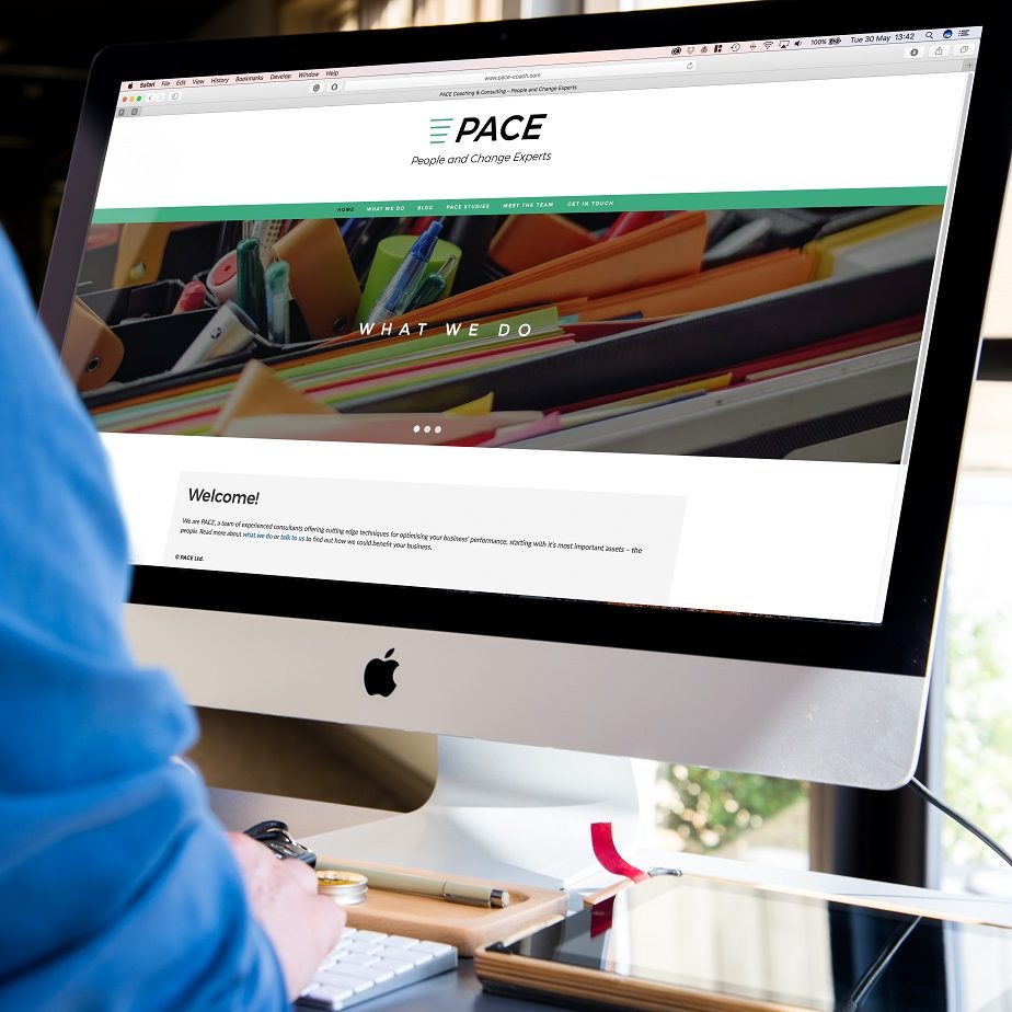
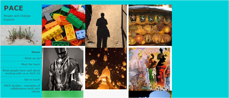
After discussing with the client how our services might be of use in order for them to refresh and modernise their business, we decided that a full re-brand of PACE Ltd. would be the most useful approach.
This included:
- New colour scheme (black, white, teal)
- New font family
- More white space (and cleaner layout)
- A separate blog and home page
- A new logo
- A new email signature
- New image colour scheme (‘rainbow’)
- Incorporating the ‘four pillar’ technique
We also discussed how a customer may journey through the site, altering the menu bar and blog titles to suit. We then focused on SEO, bringing clients to the site via engaging blog posts. We are now finalising ways to strengthen the personality for PACE, including a collection of client logos to be added to the welcome page.
Before:
After:

