
http://www.aspirepod.com
After discussing with the client how our services might be of use, we decided that a full re-design of the AspirePOD website – to build a brand based on their current logo – would be the most useful approach.
This included:
- New colour scheme (black, white, and navy)
- New font family
- More white space (and cleaner layout)
- A new blog layout
- A new selection of stock images
- A new email signature
- New image colour scheme (navy / pale)
- More copy on the welcome page to explain the nature of their business
- Links to case studies they had completed
We also discussed how a customer may journey through the site, altering the menu bar and page titles to suit.
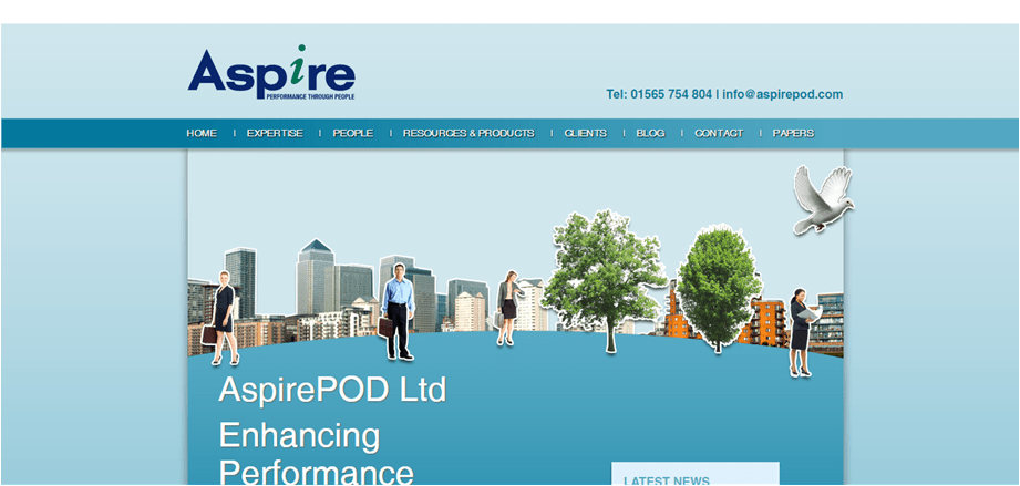
Before:
After:

